
Understanding Mobile First Indexing

Last year Google announced the rollout of their Mobile First Indexing initiative, or MFI for short. Although it was long anticipated and a hot topic in the SEO community, a year later it is still a subject shrouded in mystery to the average site owner. We’ll break it down for you and take the mystery out.
What is Mobile First Indexing?
In a nutshell, MFI is Google’s response to the ever-increasing number of mobile users. As you may know, in 2016 the number of web visits by mobile device users worldwide surpassed the number of those on laptops and desktops.
Until now, Google typically indexed the desktop version of sites, and based page rank on those. However, when content on the mobile version of the site varied from that of the desktop, mobile users suffered. What they found on the site was not what they saw in the search results.
One factor which fueled this problem was the fact that, despite all the evidence to the contrary, many site owners and even developers think of mobile usage as secondary. Many sites do not offer the same content to mobile users, often out of a well-meaning but erroneous attempt to simplify the mobile user experience. Additionally, media such as video or animation used on a site’s desktop version is often incompatible with mobile devices. To make matters worse, many site owners and developers felt for various reasons that mobile was unimportant, or less important than their “real” site.
So Google decided to start indexing and ranking any mobile version of pages it finds, in preference to the desktop version. Read that sentence again, it’s the simple answer behind all the confusion and misconceptions.

Mobile device users have taken the lead, and they’re showing no sign of slowing down. In fact, they’re gaining momentum. Recent studies show that not only are there more mobile device users these days, but that average mobile device users are spending more and more time on the internet.
How Will I Know When Mobile First Indexing is Enabled for My Site?
You will receive a notification via the Google Search console:
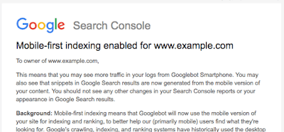
Image source: Google
How Will Mobile First Indexing Affect My Site?
This is the question everyone is asking these days. Unfortunately, there is no simple answer. Don’t take that to mean the answer is unknown, just that the answer may be a little complicated. It mostly depends on the current condition of your site.
In general, the advice of the day is, “Don’t panic!” Google understands the impact something like this could have, so they are bringing it in slowly and carefully. Google states that, “We evaluate each site individually on its readiness for mobile-first indexing based on the best practices and transition the site when the site is ready.” Breathe, sit back, and we’ll walk you through it.
First off, Google will only index mobile versions of pages when they deem they are mobile-friendly. Until then, they will index the desktop version. Below is an example of a site which is not optimized for mobile, compared to one that is optimized.
For more information on mobile-friendly design, see this article by Google.
Google also provides this handy tool to quickly test how a page scores for mobile-friendliness: Mobile-Friendly Test
The main determining factor in assessing MFI’s impact on a given site is your strategy for desktop vs mobile sites. Coming out on top with MFI comes down to these three things: Quality of content, user experience and performance. Sounds familiar, right? It should, it’s really the same old game. The only difference is that Google will now be indexing and ranking any mobile version of your pages in preference to the desktop version.
What that means is that if you are delivering exactly the same content in a way that is just as easy to use on any device, with similar load speeds on all devices, nothing will likely change for you. Pat yourself on the back and go watch a movie!
If, however, you are serving different or less content to your mobile visitors, or the interface is clumsy, your rankings will likely suffer to some degree. Likewise if you are sending your mobile visitors the same gigantic images you send to desktop users with giant peripheral monitors.
Remember not to panic. Google uses hundreds of complex “signals,” each with a set of “sub-signals,” to determine page rank. Google has stated repeatedly that this will not cause your page rank to come crashing down overnight. As they state in this Google Webmaster’s Blog entry:
“Sites that are not in this initial wave don’t need to panic. Mobile-first indexing is about how we gather content, not about how content is ranked. Content gathered by mobile-first indexing has no ranking advantage over mobile content that’s not yet gathered this way or desktop content. Moreover, if you only have desktop content, you will continue to be represented in our index.”
However, that doesn’t mean we can ignore this important change. If your site needs help, the sooner you do something about it the better.
Strategies for Delivering Content to Desktop and Mobile Devices
The internet was born in an age when users accessed it on machines that weighed over twenty pounds and were cabled to the wall. Users were stuck at desks in mazes of cubicles, websites were chiseled in stone, and all was dark.
More than two decades of this led to the concept of websites as we have known them, and it’s a difficult paradigm to break from. However, the rapid advancement of mobile devices, along with the users themselves, requires us all to re-think and adapt our concepts of websites, visitors, and how they interact.

Statistics show that 70% of high school graduates and over 90% of college graduates in the U.S. own a smart phone. Despite the rise in popularity of smart phones, ownership and usage of desktop and laptop computers has remained steady for a decade at roughly 75%. Demographically, laptop and desktop ownership rises with education and income.
Currently, the three top strategies for achieving this are responsive design, dynamic serving (aka dynamic rendering), and separate URLs. From the Google Developers Guide:
Responsive web design: Serves the same HTML code on the same URL regardless of the users’ device (desktop, tablet, mobile, non-visual browser), but can render the display differently (i.e., “respond”) based on the screen size. Responsive design is Google’s recommended design pattern.

Image source: Google
Dynamic serving: Uses the same URL regardless of device, but generates a different version of HTML for different device types based on what the server knows about the user’s browser.

Image source: Google
Separate URLs: Serves different code to each device, and on separate URLs. This configuration tries to detect the users’ device, then redirects to the appropriate page using HTTP redirects along with the Vary HTTP header.

Image source: Google
So what does all that boil down to?
As Google states here and elsewhere, “Sites that make use of responsive web design and correctly implement dynamic serving (that include all of the desktop content and markup) generally don’t have to do anything.”
Note that nobody is saying you have absolutely nothing to worry about, every article on the subject throws in that “generally” clause. That’s simply because the sheer number of possible scenarios is beyond imagination, so somebody out there might need to worry.
For more information, see this article on Google Search.
Common Misconceptions
A quick look through the forums reveals a flood of panicked questions regarding Mobile First Indexing. While we can’t cover them all, here are a few of the big ones we noticed.
Are there two indexes now, one for mobile and one for desktop?
No. Google is selecting pages that are mobile-friendly in preference to any other versions, and indexing those in their single index. If you doubt our word, Danny Sullivan (@searchliason) of Google stated most emphatically in this amusing tweet that there is only one index.
He also offers us a useful analogy: “Think of it like a library that can have one copy of every book. Initially, it was all print books. As ebooks became popular, it starts to replace the print versions with ebooks. Still one library, mix of both types but over time, it’ll be mostly ebooks.”
Does Mobile First Indexing mean that mobile-friendly sites get ranked above all others?
No. Google is only changing what they index, not how pages are ranked. If a mobile friendly version of your page is available, Google will index that, otherwise they will index the desktop version. Google will then rank your page according to whichever version they indexed.
My site uses separate URLs for desktop and mobile, like example.com and m.example.com. Will Mobile First Indexing cause all visitors to get the mobile URLs?
No. Google will index the mobile version, and show content snippets from that. The URLs will still be correct for the device.
Conclusion
The best approach to surviving Mobile First Indexing is to focus on quality of content, user experience and performance. Make sure your site is just as accessible to users on smartphones and small tablets as it is to desktop and large-tablet users. Give them all the same content presented in the same order. Make sure the site is easy to use on all device sizes, and optimize page load times for all.

Get a plan in place
Our Approach Is Different
- We listen
- Work together
- Measure success
We know how you feel, so let’s talk


